How to make open-source AI images look like movie stills: 100 Z-Image tests
Typing 'cinematic' does almost nothing. I ran over 100 16:9 frames through Z-Image Turbo, a free open model that runs on your own GPU, to find what does: the lens, the light, the grade, the film and where everyone stands.
The best frame I got all day came from describing how Akira Kurosawa shot weather, not from typing his name. With his name, Z-Image gave me a flat, colorful village scene. With "long telephoto lens, wind blowing rain and cloth across the frame, black and white, hard contrast," it gave me a hooded rider on a stone bridge with the cloak whipping sideways.
I wanted 16:9 frames that look like they came out of a movie, made with an open model I can run at home, so I ran more than 100 of them through Z-Image Turbo on my RTX 5080. It's free, Apache 2.0, and makes an image in about 6 seconds. I think the word "cinematic" is close to useless. What works is writing down the decisions a cinematographer would make: where the camera sits, what lens is on it, where the light comes from, what the color grade is and where each person stands.
How I tested
Every image is Z-Image Turbo at 1344×768, 8 steps, CFG 1, res_multistep and shift 3, with no LoRA. Every image is the first seed, with no re-rolls or fixes. When I compare two versions of a prompt, they share the same seed, so only the words changed. Click any image to see it full size.
"Cinematic film still" vs the shot written out
I started with ten small drama scenes. Each one ran twice: once as "cinematic film still of" plus the subject, and once with the shot fully described. The short version won zero of ten.
Short: cinematic film still of a lone woman walking across a desert highway at dusk
Written out: extreme wide shot of a lone woman in a long coat walking across an empty desert highway at dusk, tiny in the frame, low sun behind distant mountains, long shadows, dust in the air, warm orange sky fading to blue, anamorphic lens, horizon in the lower third, muted film color, fine grain
The short prompt gave her shorts and a flat gray sky, walking straight at the camera like an ad. The long one put her small on the road with the sun on the horizon, which is a shot someone planned.
Same pattern in the fog. The short version is a close-up of a girl staring into the lens. Writing "the red coat the only color in the frame" and "centered composition" turned her into a small red mark between tall pines.
The subway platform got green fluorescent tubes and a train's headlight coming out of the tunnel behind her. The short version is a clean modern station.
Z-Image still got details wrong. My tired detective in a motel room came out as a uniformed police officer in both versions. A family of four at dinner had five kids. An old propeller plane got a modern glass cockpit.
A framing cheat sheet
Next I tried bigger movies, each with one named framing technique. Most of the names worked. Each image below is captioned with the words that did the work. Click any one to see it full size.
The scale in the sci-fi desert wasn't something I had to fight for. The white corridor is the cleanest composition in the whole test. The western doorway did exactly what it does in old westerns, though my first version had a rider in a modern helmet who looked ready for a dressage show. Adding "wide-brimmed hat, long dusty duster coat, worn leather saddle, 1880s frontier" fixed it on every seed I tried.
The Dutch angle is subtler than I asked for, but it reads. The one that missed was a car chase I described as a "low-angle shot from the road surface," which came out at normal eye level.
The blocking shot is the one I'd copy most. Writing where each person stands, which way they face and what's between them held up in every version I ran.
Naming a director does very little
I ran six original scenes twice each. One version said "in the style of a [director] film." The other wrote out what that director's films look like. Writing it out won all six.
With his name, Z-Image made villagers sitting in a circle, in color, on a calm day. Written out, with the telephoto lens, rain blown sideways, deep focus and black and white, it looks like a Kurosawa frame.
"In the style of a Stanley Kubrick film" gave me card players under normal room light. Writing "lit only by clusters of candles, very shallow depth of field, composed like an 18th-century oil painting" got the Barry Lyndon look.
These first tests also copied the directors' subjects, like samurai, gunfighters and aristocrats in wigs. That's the wrong lesson to take from them. What's worth borrowing is how they shot, not what they shot.
The same shot in eight film languages
So I fixed the subject and the seed and changed only the camera, light, color and film. Each scene below ran with these eight additions, pasted after the scene description. Copy any of them:
Kurosawa cues
long telephoto lens compressing the background, everything in deep focus, black and white, hard contrast, heavy 1950s film grain
David Lean cues
extreme wide shot from very far away, the person tiny and the landscape filling almost the whole frame, large-format 65mm film, deep focus, low sun with a pink and gold sky and long blue shadows, rich saturated color
Sergio Leone cues
harsh overhead sun, deep focus from the foreground to the horizon, bleached yellow and brown palette, sweat and dust, 2-perf widescreen, coarse grain
Jean-Pierre Jeunet cues
wide-angle lens close to the subject so the background bends around them, heavy saturated grade of emerald green and golden amber with deep red accents, warm glowing light, slightly off-kilter playful composition, film grain
Barry Lyndon cues
lit only by one warm lamp already in the scene, deep warm shadows filling the rest of the frame, still and carefully composed like a tableau, very shallow focus, muted warm colors, a real photograph on 35mm film, natural skin texture, fine grain, clothes and setting exactly as described
Wong Kar-wai cues
shot through smeared glass, step-printed motion blur on everything moving, saturated red and green neon light, tight intimate handheld framing, heavy grain, 1990s
Modern anamorphic blockbuster
anamorphic lens with oval bokeh and long horizontal blue lens flares, fast tungsten motion picture film, teal shadows and warm orange highlights, low camera angle, very wide widescreen framing, modern big-budget cinematography
1970s 35mm
1970s 35mm film, slow zoom lens, warm faded colors with brown and amber tones, soft contrast, visible grain, available light only, gritty realism
Every subject was placed on the left or right third of the frame and told to look away from the camera. My first Leone version asked for a face in extreme close-up in the foreground. Z-Image added a stranger's head to every single shot, even the wide ones, so the version above keeps only his light and color.
I changed two others after people started using these. The Kurosawa cues used to include strong wind blowing rain and cloth, which put weather into every scene, so weather is now its own choice. The Barry Lyndon cues used to say candles and an 18th-century oil painting, which put people in wigs and candles at bus stops. The blocks above are the fixed versions. The stills below were made with the earlier wording, so expect some wind and candlelight in them.
If you run ComfyUI, download the workflow and drag it onto the canvas. You type the scene, then pick the shot from dropdowns: shot size, camera angle, lens, where the person sits in the frame, where they look, the lighting and the weather. The lighting list has 27 setups, more than half of them for night interiors, like a single table lamp, TV glow, a phone screen, an open fridge, streetlight through blinds and police lights through a window. Each choice is the exact wording that worked in these tests, and you can add your own options to any list. It joins everything into one prompt and renders it in all eight looks from the same seed, in about a minute on a 16 GB card. It only uses nodes that ship with ComfyUI, so there's nothing to install besides Z-Image Turbo, the Qwen3 4B text encoder and the Z-Image VAE.
The Kurosawa version of the rider is the one I described at the top of this post. The horse is standing on the bridge wall instead of the walkway, which is easy to miss and impossible to unsee.
The David Lean cues only work when there's a landscape to get lost in. Here they do: a tiny figure, a huge dome and the sun right behind it. Jeunet's green sky and amber ground turn the same desert into something from a children's book.
Barry Lyndon cues finally made sense indoors at night: a single candle on the table and warm darkness around her. My first wording said "like an 18th-century oil painting," and some frames came out looking painted. "A real photograph on 35mm film" fixed that. Lean's cues had nothing to work with in a kitchen, so Z-Image put a giant sunset in the window.
Wong Kar-wai's red and green split light is the strongest version of the alley.
This one tests blocking. The prompt put the detective in the left foreground with her back half turned and the suspect seated on the right, under one bare light, with an empty chair between them. Every version kept that staging. Writing where each person stands is one of the most reliable things you can put in a prompt. The detective still became a uniformed officer, two versions printed "POLICE" on her back, and the anamorphic version doubled the suspect.
In this earlier version I named the film and lens brands, "Panavision" and "Kodak Vision3 500T." The flares look right, and a garbled "Kodk" logo showed up on the bus. Brand names turn into text. Describing the lens and the film without the names kept the look and lost the logo.
Light matters more than the grade
The film looks get the attention, but light did more work in these tests than anything else. Here is one scene and one seed, a woman waiting at a bus shelter at the edge of a small town, with only the light changed. I'm writing a separate post with many more lighting setups, inside and out.
The shelter, the road and the woman barely move between versions. Everything you feel about the picture changes anyway. When some of my early tests looked like stock photos, I first blamed the grade. It wasn't the grade. Those prompts had no light source, so Z-Image lit everything evenly, and a film grade on top of flat, even light still looks like stock. Name where the light comes from first. The grade is the last ten percent.
The fuel hose
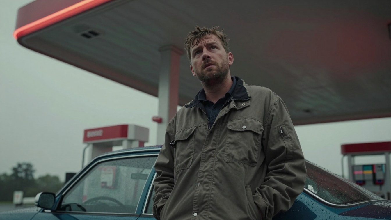
My first header image took six rounds. The first version had the man holding the fuel nozzle against his chest. Describing the nozzle "plugged into the fuel cap on the rear fender" put it on the front door in four out of four seeds. Then I wrote "no fuel hose or nozzle in the frame," and got four pictures of fuel hoses. Naming a thing, even to rule it out, puts it in the picture. What finally worked was moving him to the hood and never mentioning the hose at all.
The header I ended up using came from somewhere else. I set every menu in my shot builder to Random and ran it twice. The second run picked a worm's-eye view, an ultra wide lens, red and green neon and light rain, and it beat everything I'd planned.
You can try the same menus in the free ComfyUI workflow. Type a scene, pick the shot, light and weather, and it renders all eight looks from one seed.
Tested on an RTX 5080 with 16 GB of VRAM.