Asset trading for Advanced Traders
Designing powerful tools for beginner to institutional traders
Role: Director of Product Design
Timeline: 2022 - 2025
Platform: Web, Desktop, Mobile
The Challenge
Kraken is one of the world's largest cryptocurrency exchanges, handling over $200B in trading volume. The platform serves everyone from first-time crypto buyers to institutional traders moving millions of dollars per trade.
The problem: these users have completely different needs. A beginner wants simplicity and confidence that they won't accidentally lose money. An institutional trader wants speed, precision, and advanced tools like margin trading, futures, and algorithmic order types. Most platforms pick a side. They either dumb things down for beginners or build complex interfaces that intimidate casual users.
The core design challenge: how do you design a trading platform that feels approachable to beginners while giving professional traders the power and speed they demand?
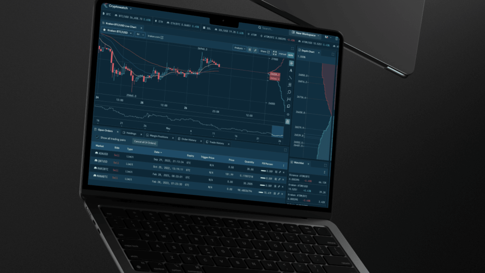
The interface on cryptowatch is my favorite UI I have ever used as a trader....

Approach
Understanding the User Spectrum
I led a design team responsible for the trading experience across web, desktop, and mobile. Early on, we mapped out the full user journey from someone buying their first Bitcoin to institutional traders running sophisticated trading strategies. The insight wasn't that we needed two separate products. It was that we needed adaptive interfaces that could scale with user expertise.
Progressive Disclosure at Scale
The strategy was progressive disclosure, but not in the traditional sense. We didn't just hide advanced features behind menus. We designed the information architecture so beginners could complete core tasks without encountering complexity they didn't need, while power users could access everything without friction.
This meant rethinking navigation, order entry flows, and how we surfaced market data. A first-time user should be able to buy Bitcoin in three clicks. An institutional trader should be able to place a stop-limit order with custom triggers without leaving their keyboard.
Cross-Platform Consistency
Trading happens everywhere. Some users monitor positions on mobile and execute trades on desktop. Others run real-time analysis on web and use mobile for alerts. We couldn't design three separate experiences. The mental model, interaction patterns, and visual language needed to be consistent across platforms while respecting the constraints and affordances of each.
Iterative Validation
We ran continuous user testing with both novice and expert traders. The most valuable sessions were watching traders use the platform under real market conditions, not controlled test scenarios. When markets are volatile and money is on the line, you see which design decisions hold up and which ones fall apart.
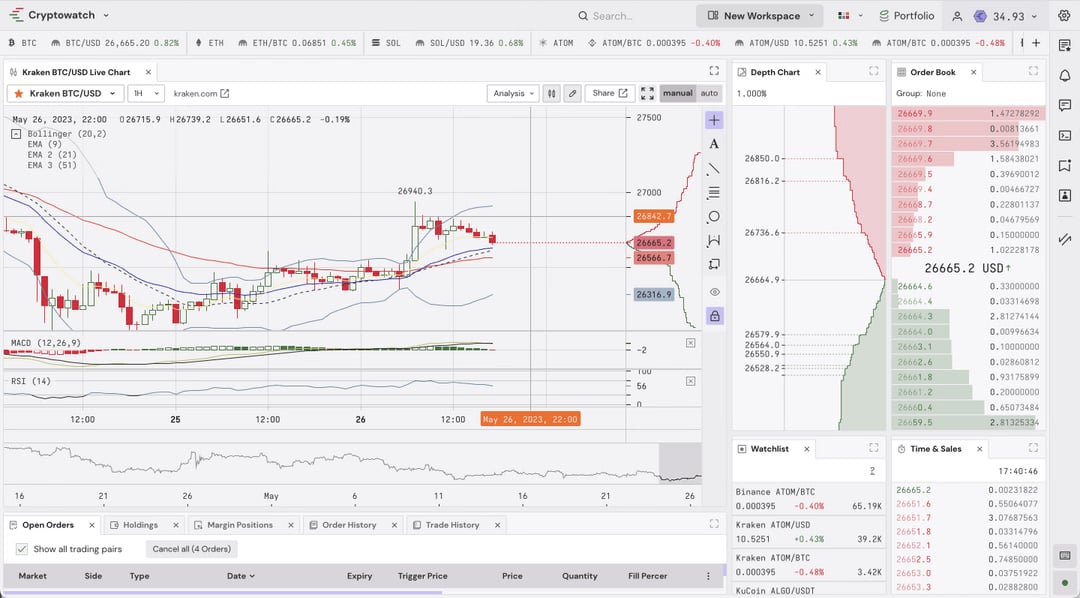
Solution Highlights
Impact & Results
$200B in Trading Volume
The platform facilitated over $200B in trading volume, serving users across the full spectrum from retail to institutional. The design supported high-velocity trading without sacrificing accessibility for newcomers.
24% Increase in New User Profile Creation
By analyzing user feedback and implementing UX improvements focused on onboarding clarity and reducing friction, we increased new user profile creation by 24%. This reflected our success in making crypto trading less intimidating for first-time users.
100% On-Time Delivery for Two Consecutive Quarters
Led alignment between design, product, and engineering to prioritize features effectively. This cross-functional collaboration resulted in 100% on-time delivery for two quarters, demonstrating that design leadership isn't just about craft but about operational excellence.
User Feedback from Professional Traders
Professional traders consistently cited the interface as their favorite trading UI. This validation came from users who trade for a living and have used every major platform. When your interface becomes a competitive advantage for professional users while remaining accessible to beginners, you've solved the core tension.
Reflections
The hardest part wasn't designing for beginners or experts separately. It was designing one system that served both without compromising either. Early versions tried to be everything to everyone and ended up being mediocre for both audiences. The breakthrough was accepting that different users would see different versions of the same underlying system.
The biggest insight: speed matters more than you think. Professional traders will forgive visual quirks if the platform is fast and reliable. But no amount of polish saves a slow interface when money is moving. Performance became a design constraint, not an engineering afterthought. We designed with latency budgets in mind, optimizing for perceived speed through skeleton states, optimistic updates, and immediate feedback.
If I were starting over, I'd invest more in understanding the emotional side of trading. Trading isn't just a technical activity. It's stressful, emotionally charged, and mistakes are costly. The best interfaces acknowledge this by building in friction at the right moments (confirmations before large trades) and removing it everywhere else (instant access to account status, clear error recovery).