The median pricing page uses 13 font sizes
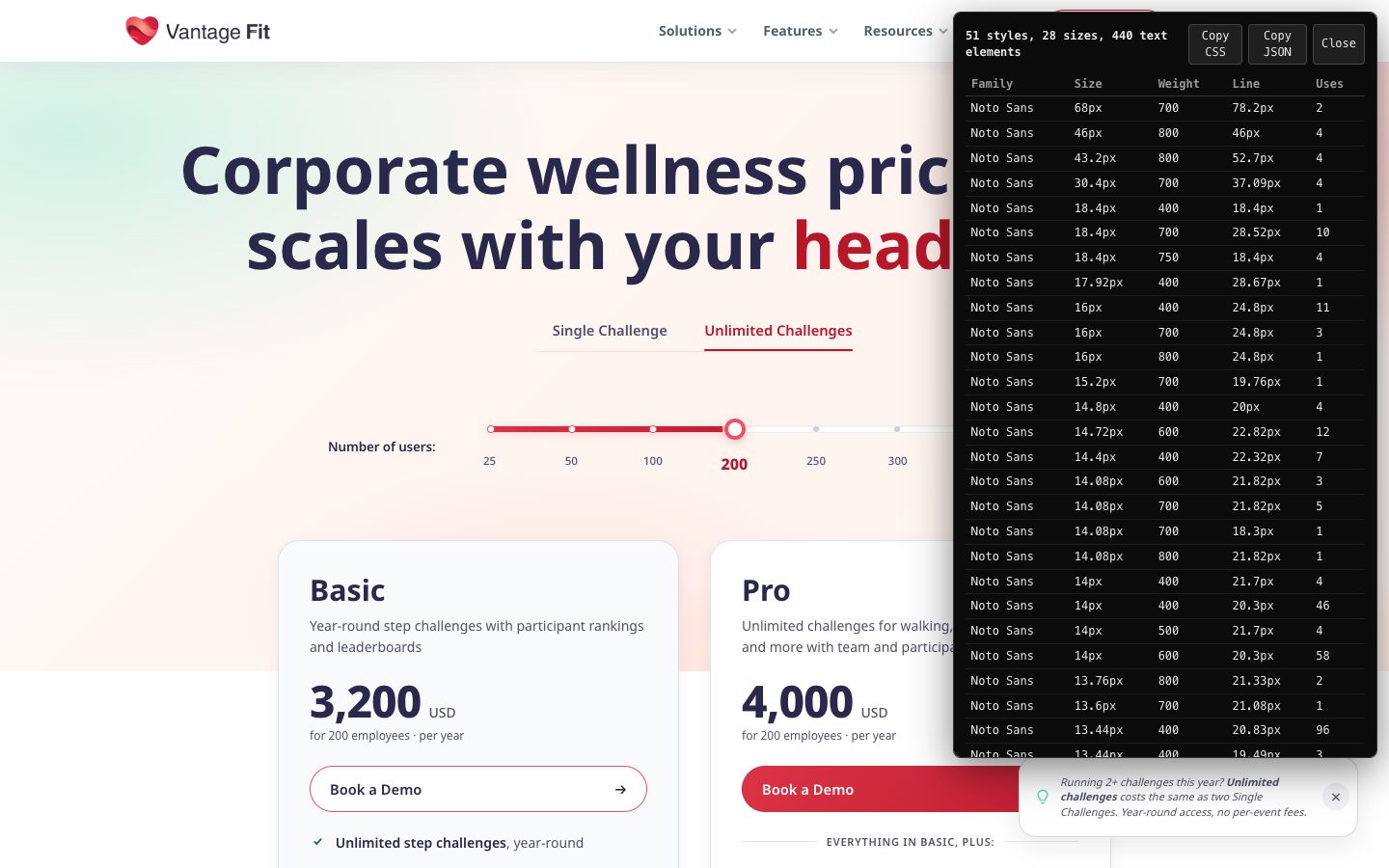
I ran a font audit on 95 software pricing pages. The median uses 13 distinct sizes, the range is 6 to 28, and Linear's page does it in 8.
October 14, 2026Linear's pricing page uses 8 font sizes. Vantage Fit's uses 28, including 13.44, 13.6, 13.76, 14, 14.08, 14.4 and 14.72 pixels. Most people can't see the difference between those.
I ran the font size checker on 95 software pricing pages, the same pages as in the pricing page examples post. The median page uses 13 distinct sizes. The range is 6 to 28. Eight pages use 8 or fewer. Thirty-one use 15 or more.
Body text lands on 14 or 16 pixels almost everywhere. Fourteen is the most-used size on 35 pages and 16 on 34, and those two sizes cover 68% of all the text elements I counted. Ninety-two of the 95 pages use 16px somewhere.
Sixty-eight pages use at least one fractional size, like 12.8 or 14.4. Those are usually rem math (0.8rem, 0.9rem), which means nobody picked them. Vantage Fit shows it clearly: its page carries 14.08px text in four different combinations of weight and line height.
Small text is common too. Fifty-one of the 95 pages set something below 12 pixels, and 34 go down to 10 or lower.
The tidy pages are less tidy than the count suggests. Linear's eight sizes are 13, 14, 15, 16, 17, 24, 48 and 72. Five of the eight sit between 13 and 17 pixels. Notion also uses eight: 12, 14, 15, 16, 22, 32, 54 and 64. Both have a cluster of near-identical body sizes and then big jumps up to the headline.
Supabase uses 11 sizes and Vercel 10. Close uses 21.
Most pages use two font families and four weights. Inter is the main family on 10 pages, Roboto on 6, Open Sans on 3. The rest are spread across custom fonts.
Run the checker on your own product and see where you land.